# Your performance review is a memory test
> We scored 740 pull requests by severity, multiplied each one by how much our roadmap cared about the component it touched, and published the leaderboard. Two people turned out to be 58% of the output. Here is the formula, and here is everywhere it is still wrong.
- Source: https://jays.fyi/blog/your-performance-review-is-a-memory-test
- Author: Jay Derinbogaz
- Published: 2026-08-08
- Language: en
- Tags: engineering-management, performance-reviews, ai, gitrank
- Reading time: 20 min
---
Ask any engineering manager who their best engineer is. Watch how fast the answer
comes. There is no hesitation, no caveat, no "let me check something first." They
know. They have always known.
Now ask them to show the work.
You will get a story. A good story, usually, about an incident somebody handled
at 2am, or a refactor that unblocked a quarter, or the person who always answers
in the channel. What you will not get is a number, or a comparison, or any
account of the four engineers whose work the manager was not in the room for.
The confidence was never based on measurement. It was based on recall, and recall
is a function of proximity.
Here is the thesis, and everything after this is evidence for it. Engineering
performance is judged from memory, memory rewards visibility rather than value,
and the thing you actually want people to build is written down in a roadmap that
is never connected to the thing you rate them on. Those two documents, the
roadmap and the performance review, have nothing to do with each other in almost
every company I have seen, including mine until recently.
So we connected them. Every merged pull request gets read by a model, assigned a
severity, and multiplied by how much our roadmap cares about the component it
touched. The result is a monthly leaderboard, and it feeds bonus decisions.
I am going to show you ours, including the parts where it is embarrassing and the
parts where it is wrong.
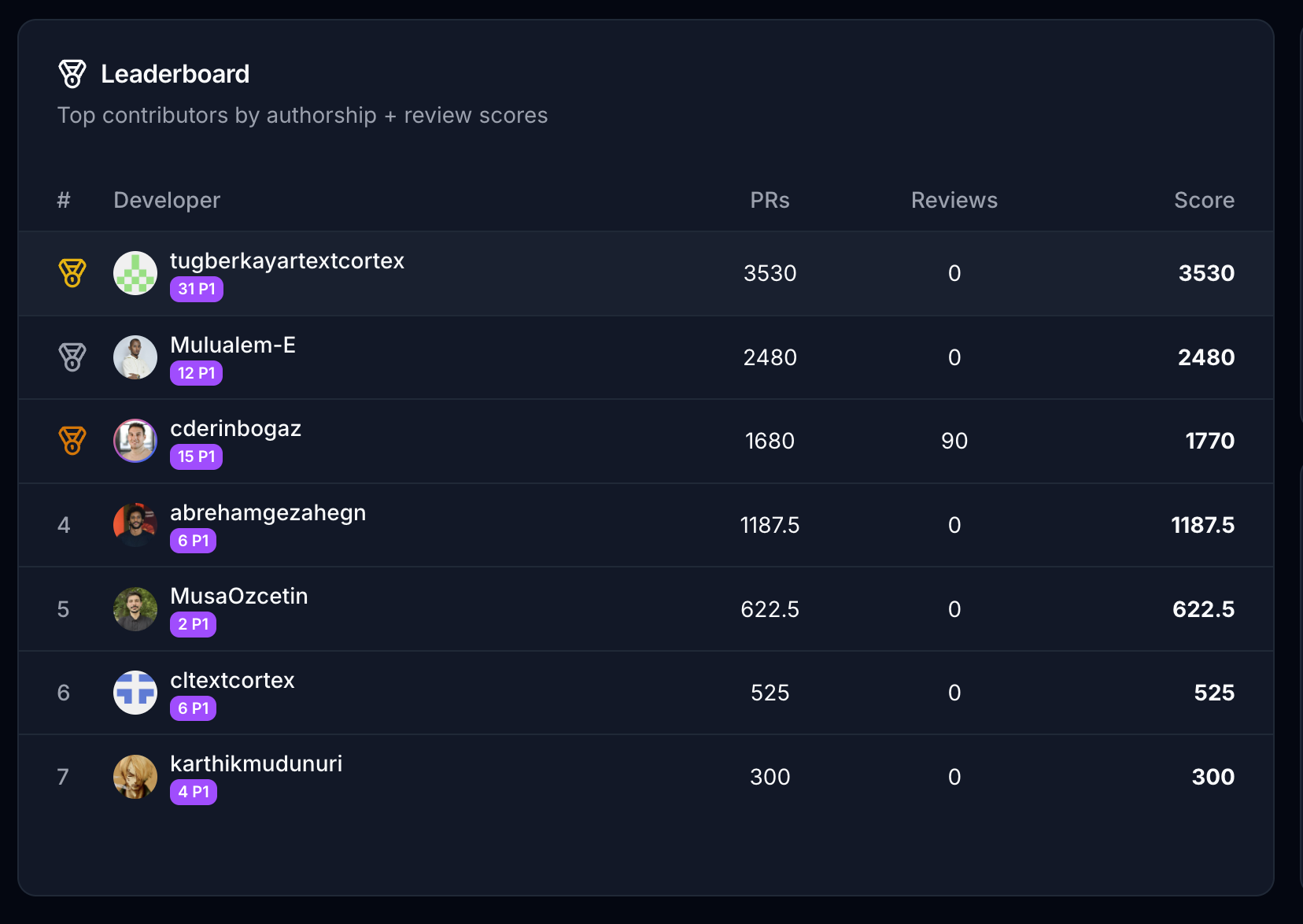
The 30-day leaderboard for our platform repository, August 2026. Seven developers, 10,415 points between them.
## The received wisdom is that this cannot be measured, and the received wisdom is a shrug
The standard position on measuring individual engineering output is that you
must not, because every proxy is a trap. Lines of code rewards bloat. Commit
count rewards splitting. Story points are a negotiation, not a measurement. Even
the good frameworks are deliberately team-level: DORA measures four things about
a delivery pipeline and says nothing about people, which is a design choice its
authors are explicit about.
All of that is correct, and none of it is an answer. Refusing to measure does not
produce a company where nobody is ranked. It produces a company where everybody
is ranked anyway, by a mechanism with no audit trail. The ranking still happens
at compensation time. It just happens in a room, from memory, weighted by who the
person in the room spent the most time with.
Call it the **loud engineer premium**: the gap between how well you are rated and
how well you performed, explained entirely by your distance from whoever writes
your review. It is not a character flaw in managers. It is the predictable output
of asking a human to compare fifteen people's technical contributions across a
year using nothing but what they happened to notice.
The premium was unavoidable until about two years ago, because the raw material
for a better answer was a pile of diffs that nobody had time to read. That
constraint is gone. A model can read every diff in your repository every month
for less than the cost of one hour of the meeting where you currently guess.
Reading them is the easy part. Deciding what the reading is worth is the whole
problem, and that is not a technical question.
## The entire formula fits on one line
Here it is, in full, from the scoring path in
[GitRank](https://gitrank.dev):
```
final_score = is_eligible ? severity_base_points × component_multiplier : 0
```
That is not a simplification for the blog. That is the line. There is no hidden
regression, no learned weighting, no reputation term, no tenure adjustment.
Severity times importance, or zero.
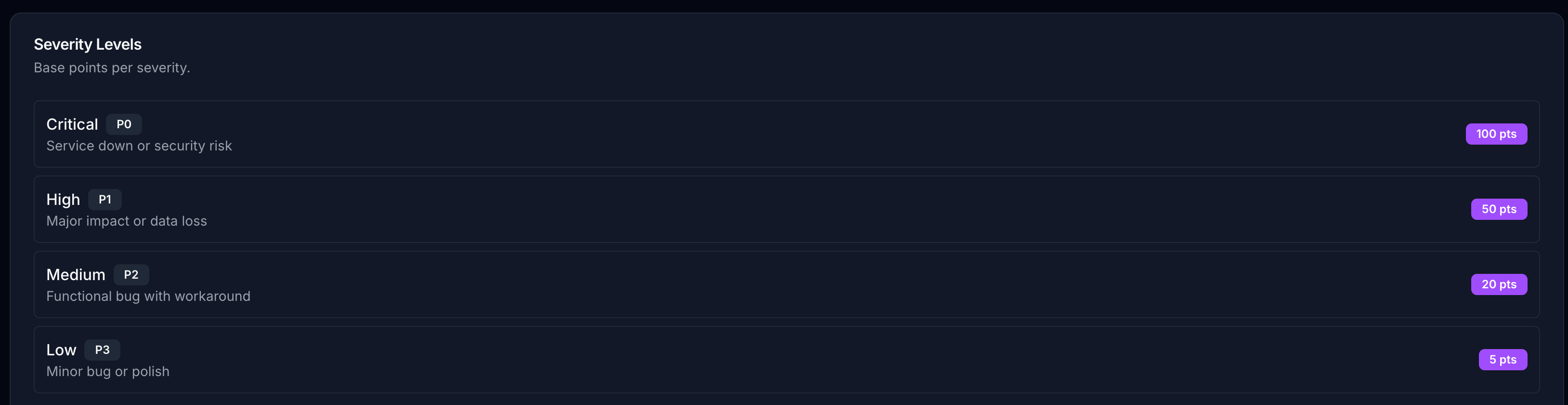
The severity half is a fixed ladder. Four levels, four point values, set once and
visible to everyone being scored:
Base points per severity. A model assigns the label; the point values are ours.
A critical fix is worth twenty low-priority ones. That ratio is a policy
statement, and we wrote it down rather than leaving it in somebody's head.
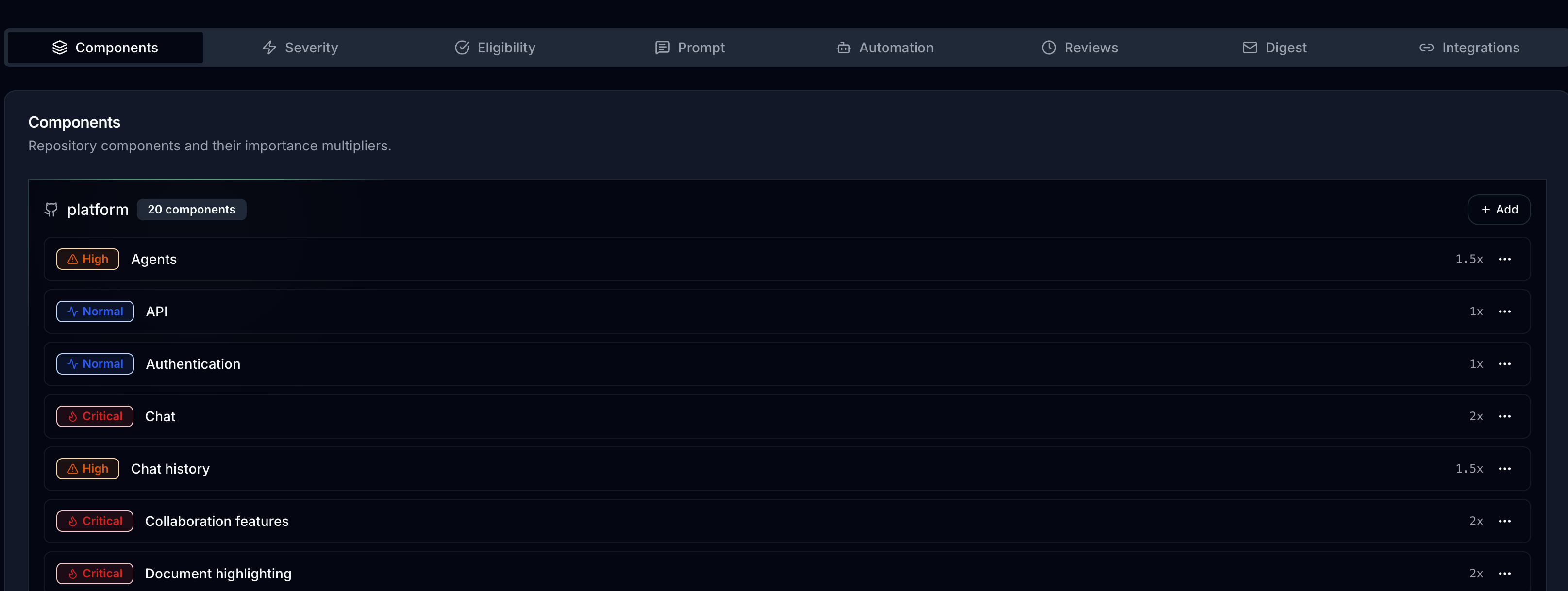
The importance half is the part that actually matters, and it is the reason I
think this approach generalises. Every component in the repository carries a
multiplier, and the multiplier is set by what the product needs this quarter:
Twenty components, four importance tiers. Critical is 2.0x, High is 1.5x, Normal is 1.0x, Low is 0.5x.
Chat is 2.0x because chat is what we are betting the product on. Authentication
is 1.0x because it works and we would like it to keep working quietly.
Collaboration features and document highlighting are 2.0x for the same reason
chat is. None of those numbers are technical judgments. They are the roadmap,
retyped into a field that pays.
This is the move. Not the model, not the leaderboard, not the gamification. The
move is that the strategy document and the compensation input became the same
document. If the roadmap changes in October, the multipliers change in October,
and the incentive changes in October rather than at the next annual review cycle
in fourteen months.
Let me spell this out, because it is the part people skip. The hard problem in a
growing engineering organisation was never that people are lazy. It is that
forty smart people, each optimising locally and honestly, will collectively
produce a quarter of work that does not add up to the thing the company said it
wanted. Middle management exists largely to fix that by carrying the strategy
around in conversation, one desk at a time, losing fidelity at every hop. A
multiplier table does the same routing job in one hop and does not get tired,
does not have favourites, and does not forget what you told it in January.
## A critical fix in chat is worth forty polish commits in the API
Run the two halves together and the spread is severe.
A P0 in chat scores 100 base times 2.0, so **200 points**. A P3 in the API scores
5 base times 1.0, so 5 points. The most valuable single pull request you can
merge here is worth forty of the least valuable. Not forty percent more. Forty
times.
That number is deliberately violent, and it does the thing gentle incentives
never manage to do. Nobody reorganises their week around a 15% difference. People
absolutely reorganise their week around a 40x one.
Look at what happens to a real week under those weights. Here is severity
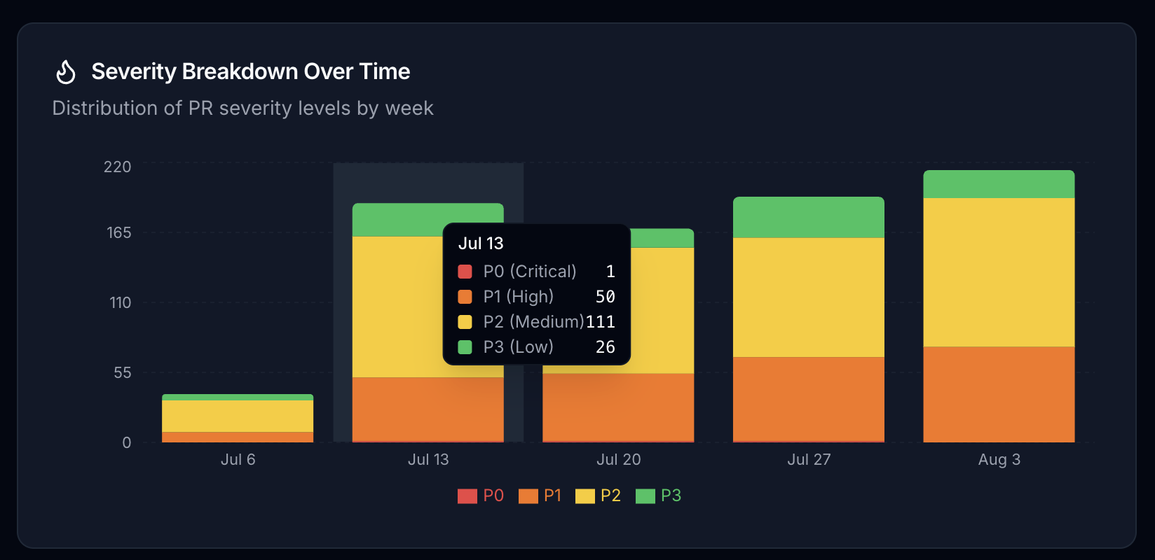
distribution across five weeks, with the week of 13 July expanded:
Week of 13 July 2026: 1 P0, 50 P1, 111 P2, 26 P3. 188 merged pull requests.
188 pull requests. P2 is 59% of them, which is what a normal engineering week
looks like everywhere: mostly medium-sized fixes with a workaround available.
Now weight it. Those 111 P2s are worth 2,220 points at 1x. The 50 P1s are worth
2,500. **Fewer than half as many pull requests carry more than half the value of
the week**, and the single P0 is worth as much as twenty of the P3s that a raw
commit count would have treated as identical work.
That is the entire argument for weighting, in one week of real data. Count pull
requests and you conclude the week was about P2s. Weight them and you find the
week was about fifty specific pieces of work, and you can name who did them.
## Two people were 58% of the output, and I would not have guessed the order
Back to the leaderboard, because this is where I stopped trusting my own
intuition.
Seven developers, 10,415 points across the 30-day window. The top developer holds
3,530 of them, which is **33.9% of everything the team produced by value**. The
top two hold 57.7% between them.
I want to be careful about what that does and does not mean. It does not mean the
other five are underperforming, and if you read it that way you have learned the
wrong lesson from this post. Concentration like that usually means the top two
are working on the highest-multiplier components, which is exactly what the
system is designed to reward and exactly what we asked them to do. The number is
a description of where value is landing, not a verdict on five people.
But look at the ordering, because it broke my prediction. Here is who owns what:
Primary contributor per component. One person is the leading expert on both of the two busiest areas.
Mulualem-E is the primary expert on chat, our 2.0x component, with 71 of its 230
pull requests. He is also the primary expert on agents, our 1.5x component, with
86 of 148, or 58% of that area. If you had described that to me and asked who
tops the leaderboard, I would have said him without pausing. He is second.
The top spot goes to tugberkayartextcortex, with 31 P1 pull requests against
Mulualem-E's 12. Severity mix beat component ownership. Owning the most important
area of the product is not the same as repeatedly landing high-impact work in it,
and until we published this I could not have told you which of those two things
our compensation was actually rewarding. It was rewarding whichever one I
happened to have noticed.
That is the loud engineer premium, caught in the act, in my own company. My
intuition had the right two people and the wrong order, and the wrong order is
what a bonus is.
## The person who wrote the most code is in last place
Now the finding that made me uncomfortable, which is the one I want you to
actually sit with.
karthikmudunuri is the primary expert on the presentation maker, with 51 of that
component's 58 pull requests. That is 88% of an entire product area. Volume is
not his problem. He is last on the leaderboard, with 300 points.
There is a combination that lands exactly on that number: four P1 pull requests
in a 1.5x component, and nothing else scoring at all. 4 × 50 × 1.5 = 300. His
badge says 4 P1, which fits. I cannot prove that is the real decomposition from
this dashboard, and I want to flag the imprecision honestly, because the
leaderboard covers 30 days while the component charts cover 6 July to 3 August,
so the two windows are close but not identical.
If the decomposition is right, roughly 47 merged pull requests produced zero
points. There are only two explanations. Either they were genuinely low-severity
polish, in which case the score is correct and the useful conversation is about
whether we should have a person spending a month at 88% concentration on a
component we have not marked as important. Or they were real work that the
eligibility gate zeroed out, in which case the score is wrong and the tool owes
him an explanation.
The scoring is all-or-nothing on eligibility. Fail one enabled criterion, and the
default set is issue linkage, fix implementation, PR description quality, tests
where the model judges tests are required, and a 3,000-line ceiling, and the
score is zero regardless of severity. A genuinely critical fix with a bad
description scores the same as nothing at all.
I do not know which explanation is right, and here is my actual complaint: the
dashboard should be able to tell me, per pull request, and today it makes me
reverse-engineer it from a total. That is a real gap in our product and it is
being fixed. It is also the exact failure mode people fear about scoring systems,
so I am not going to pretend I found it in a design review. I found it while
writing this post.
## Where the bugs are is a product decision, not an engineering one
The other thing that falls out of scoring every pull request is that you stop
arguing about quality from anecdote.
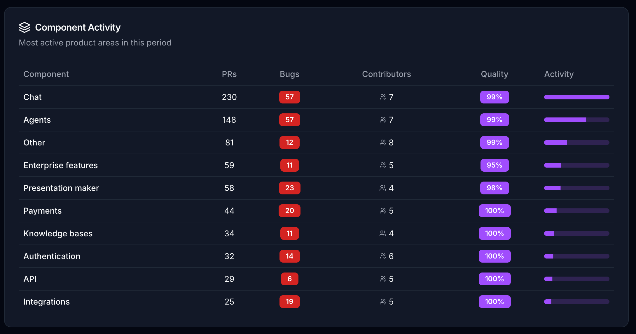
The ten busiest components, 6 July to 3 August 2026. 740 pull requests, 230 of them bug fixes.
740 pull requests across the ten busiest components. 230 of them, **31%, were bug
fixes rather than new work**. Chat alone is 230 pull requests, another 31%, which
is what a 2.0x multiplier is supposed to look like when it is working.
Then there is the presentation maker: 58 pull requests, 23 of them bugs. That is
a 40% bug rate in a component with four contributors, against 25% in chat with
seven. And payments is 44 pull requests with 20 bugs, a 45% rate, in the
component that touches money.
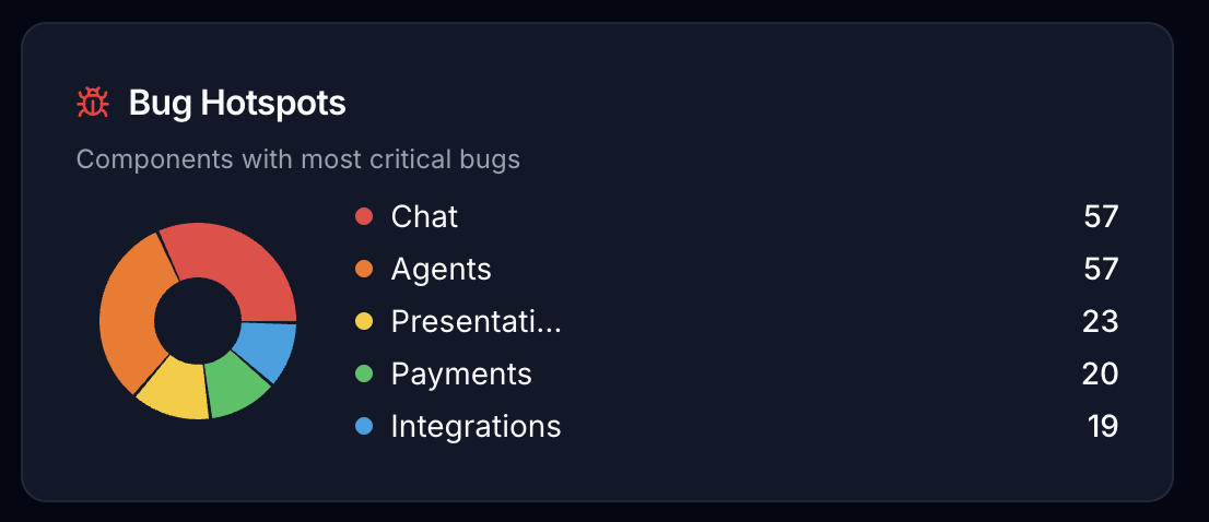
Critical bugs by component. Chat and agents are tied at 57 each.
Chat and agents are tied at 57 bugs each, but chat produced those over 230 pull
requests and agents over 148. Same bug count, 55% more work behind one of them.
That is a signal about agents that no retrospective was ever going to surface,
because no single person on the team merged enough of both to notice.
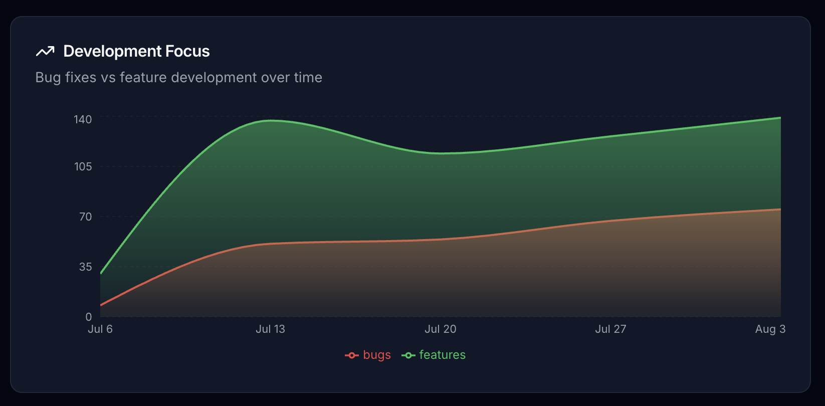
Bug fixes against feature development over the same five weeks.
The bug line and the feature line rise together over the window rather than
trading off, which is the shape you want and not the shape I expected. I am
reading that chart as descriptive, not as a claim that we improved something. It
covers five weeks and the trend is inside the noise you would get from a single
large project landing.
## Here is where our own tool is currently wrong
If I only showed you the parts that work, you would be right to discount all of
it. So:
**The prompt tab does not do what it says on the production path.** There is an
admin screen that lets you customise the evaluation prompt. It drives the batch
evaluation runner. The webhook and cron path that scores pull requests in
production uses a prompt hardcoded in the source. If you edit that template
expecting it to change your live scores today, it will not, and nothing in the UI
tells you so.
**The dashboard's leaderboard column labelled "PRs" is not a count of pull
requests.** It is the authorship score. You can see it in the screenshot above:
the top row reads 3530 under PRs and 3530 under Score. The standalone leaderboard
page gets this right, with separate columns for pull requests and authorship, so
it is a mislabel on the one screen everybody actually opens, which is close to
the worst place to have one.
**Our README publishes the wrong point values.** It says P2 is 25 points and P3 is
10. The database seeds 20 and 5, and the configuration screenshot above confirms
20 and 5. The documentation and the software disagree about the scoring, and the
software wins.
**The review track is close to dead.** Reviewing other people's code earns points
on a separate velocity ladder, faster reviews scoring higher. Across that entire
leaderboard, exactly one person has any review points at all: 90 out of 10,415
total, or **0.86% of everything scored**. Whatever we think we are incentivising
about code review, we are not. The most likely reason is that review sync only
started collecting recently, but I have not confirmed that, and until I do the
honest reading is that the feature is not landing.
**Our own FAQ claims roughly 90% classification accuracy and I cannot back it
up.** There is no eval set in the repository, no benchmark script, and no
adjudicated corpus behind that number. It is a claim I would not accept from a
vendor, and it is on our own marketing page. It is coming down.
## A scoreboard gets gamed, and ours has almost no defenses
I went looking through our scoring code for anti-gaming measures. Here is the
complete list of what exists.
Pull requests over 3,000 changed lines are ineligible, which stops the crudest
form of padding. Self-reviews score zero and are excluded from every leaderboard
query. Reviews from accounts with `[bot]` in the login are skipped. The model is
asked whether the code actually does what the description claims, which is the
nearest thing to a nonsense detector. Admins can override any score, and the
override requires a written reason of at least ten characters.
Here is what does not exist. No per-person weekly or monthly point cap. No
diminishing returns on repeated work in the same component. No time decay of any
kind, and the 30-day window on the leaderboard is a default date range anyone can
widen rather than a cap. No duplicate or revert detection, so fixing something you
broke last week scores like fixing something somebody else broke. No collusion
detection between reviewers. And the bot filter applies to reviewers but not to
pull request authors, so a bot-authored merged pull request scores like a human
one, which in 2026 is not a hypothetical.
Anyone determined to farm this system can. Split work into more pull requests,
each with an issue link and a clean description, aimed at the 2.0x component.
That is the exploit, and I want to name it precisely because of what it looks
like: it looks like small, well-documented, well-tested changes to the most
important part of the product. The most effective way to cheat our scoreboard is
to do the thing we want. That is not an accident, it is the design goal, and it
is the only defense against Goodhart's law that has ever actually worked. Make
the proxy expensive to fake in any way that is not the real thing.
It is not a complete defense. Severity is assigned by a model reading a diff, and
a model can be talked into calling a medium bug a high one by a sufficiently
dramatic pull request description. We have not measured how often that happens.
Nobody has. If you are evaluating any tool in this category, including ours, that
is the question to ask, and "roughly 90%" is not an answer.
## I am not going to give you the uplift number, because I do not have one
Here is the claim I would like to make. Since we started publishing this
leaderboard monthly, work has visibly shifted toward the components we marked as
important, because engineers want the score.
Here is why I am not making it as a number. We turned this on mid-stream, with no
clean baseline, no control repository, and no pre-registered definition of what
"shifted" would mean. The multipliers changed during the period. So did headcount
and roadmap. Any percentage I published would be a number I chose after seeing
the data, which is not a measurement, it is a decoration.
What I can tell you is qualitative and I am labelling it as such. The arguments
changed. People stopped asking me whether their work was appreciated and started
asking why a component was rated 1.0x. That is a much better argument to be
having, and it is the one thing I would have paid for on its own.
If I ever have a real before-and-after, I will publish the methodology first and
the number second. If I publish it the other way around, do not believe me.
## Point it at the roadmap, then hand people the ruler
I want to end above the product, because the product is the least interesting
thing here.
The org chart's real job was never authority. It was routing. It carried the
answer to "what matters this quarter" outward from the people who decided it, and
carried the answer to "who did what" back inward, and it did both badly, slowly,
and with enormous distortion at every hop. Everything you dislike about corporate
politics is a compression artifact from that routing. Managers were not the cause
of it. They were the only available hardware.
They are not the only available hardware any more. A model that reads every diff
plus a table of multipliers does the outward routing in one hop and the inward
routing in a query. What is left for the humans is the part that was always
actually the job and never had time: deciding what the multipliers should be, and
sitting with the people whose scores those decisions moved.
The politics do not disappear. Do not let anyone sell you that. They move. They
move from "does my manager remember my quarter" to "why is my component rated
1.0x when the roadmap says it is core," and that second fight is a fight about
the company's actual strategy, conducted in public, in a table anyone can read. I
would rather have that fight every month than the current one, which is conducted
once a year, in private, by someone reconstructing eleven months from memory.
Somebody is going to run this badly. Somebody is going to put a scoreboard on a
wall with no eligibility explanations and no override trail and fire the bottom
decile, and it will be a disaster, and it will be blamed on the model rather than
on the person who chose the multipliers. That is the part that gets paid for, and
it will not be paid by the person who set it up.
So measure me with the same instrument. If you run something like this, publish
three things alongside the leaderboard: the multiplier table, so people can argue
with the strategy rather than the score. The per-pull-request breakdown, so
anyone who scored zero can see which gate closed on them and appeal it. And the
override log, because the number a human changed is the only number worth
auditing.
We currently publish the first. We do the third badly: an override writes its
reason onto the evaluation row, and clearing the override deletes the reason with
it, so what we have is a note that can be revoked rather than a log. And we do not
publish the second well enough, which I only found out because a developer with
88% of a component ended up last on my own leaderboard and I could not explain to
him why.
---
*GitRank is at [gitrank.dev](https://gitrank.dev) and is licensed CC BY-NC 4.0.
Scoring on the production path runs on Claude Haiku 4.5 at temperature 0.3. All
figures above are from
our own platform repository between 6 July and 3 August 2026, sample size one
company and seven developers, which is a description of us and not a benchmark
of anything.*